My role: Motion design • Digital design • Art direction
Balance Launch
Digital design
Motion design
Art direction
Art direction
Motion design
Sound design


.png)

Balance aims to be Dubai's Most Powerful Wallet by providing new ways to save, spend and grow money while accessing exclusive privileges across popular brands in the UAE.
Background
For the launch of the Balance app, the team wanted to create visuals that captured the essence of Balance, being a modern, sleek
and simplistic digital wallet. So when approaching this campaign I used the Balance neumorphic UI as a base for creating these visuals. My aim in taking this approach was to make the customer journey from the moment they see the first ad to the moment they open the app to sign up feel cohesive and seamless.
Objective
Challenges
Solutions
Showcase the features and services offered by Balance to potential customers
Create matrial shaders and world assets using the colours of the Balance app's UI to match the astetic of both the Light and Dark mode versions
Create a Light and Dark mode versions for the balance introduction video
Take an abstract approach with the key visual to represent the features and services
Establish a key visual style based on the Balance UI that can be used as reference for all assets
Maintaining a consistant look for key visuals used throughout the campaign

Brand vision


Light mode
#F1F4F6
Anti-flash white
#D1D9E6
Lavender (web)
#848C98
Slate grey

Dark mode
#111111
Night
#000000
Black
#959598
Taupe grey
Design specifications

Typeface

TT Commons
The app introduction video was repurposed as a launch video advert for social media. Minor alterations were made to some of the scenes, e.g. replacing the Emirates ID with a Balance Mastercard card, also an end scene was added to encourage viewers to download the app via a QR code.
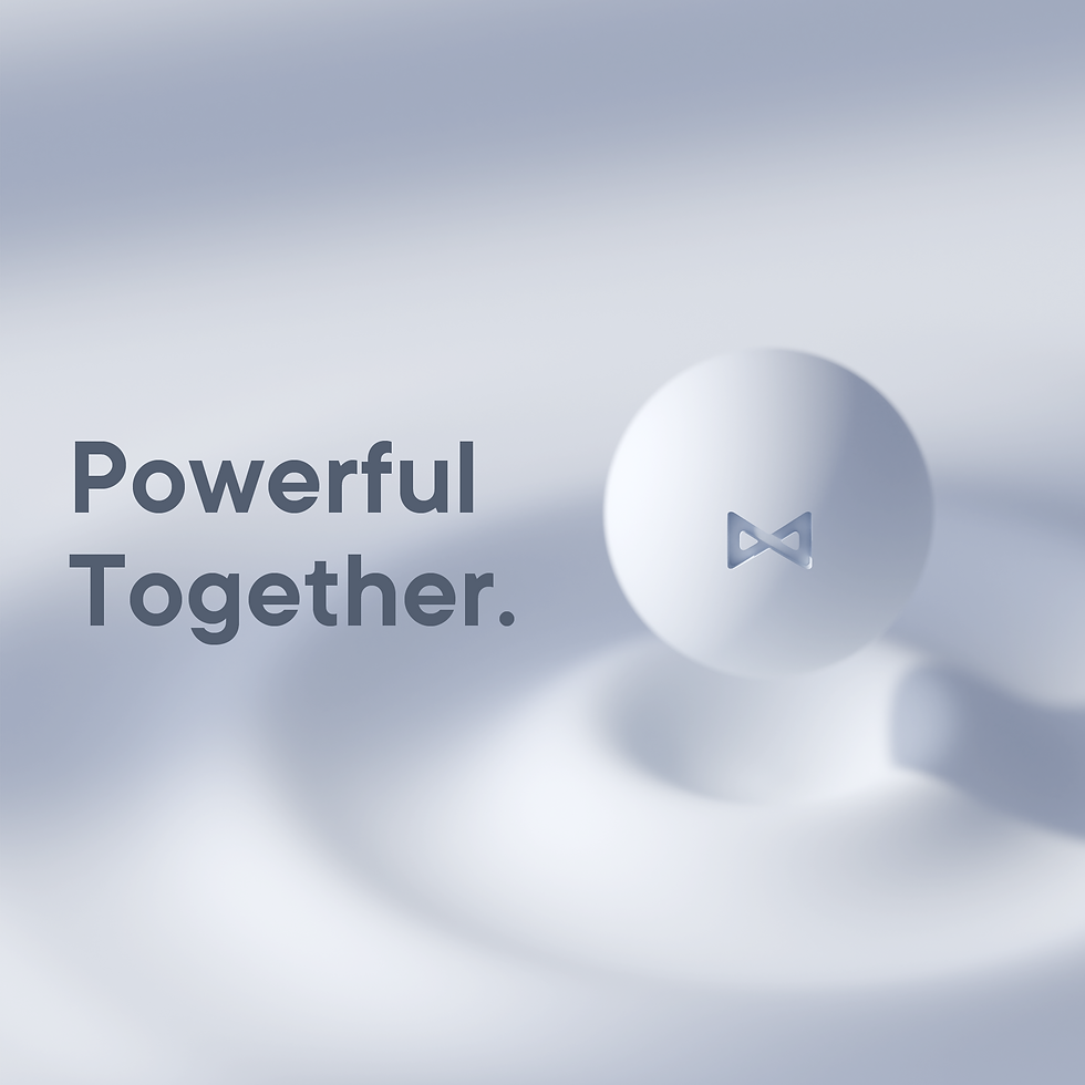
Key visuals were also created based on the video's aesthetic, these were used across various social media platforms for paid and organic ads.
Social media marketing


Here are the app preview images produced for the App Store.
App store preview


Results
Overall I was happy with the visual assets produced for this campaign. I felt that I was able to achieve the objective of giving the customers a seamless journey at every stage of discovering Balance.
The challenging aspect of this project was translating the UI of the Balance app to 3D renders. Initially, using the colour palette of the app made the object look flat but I was able to negate this through lighting, ambient occlusion and a custom gradient the scene to create distinct soft shadows. I also added some volumetrics to the scene to enhance the soft neumorphic look.
The Balance team was happy with the results of the campaign as there was a significant increase in total sign-ups and active users.
+335%
Total sign-ups
+360%
Verified active users
Balance Gold membership is a subscription plan that offered users access to exclusive offers with many well known high end and everyday brands.
To encourage users to upgrade a range of imagery were created centred around the strapline 'Upgrade your Lifestyle'.
Gold membership


These series of mood boards where a key source of inspiration to establish the look and direction of the campaign .
Mood boards


The main inspiration for the introduction video was a landing page video animation for Brain minimalist by Gleb Kuznetsov. The first sequence of the introduction video is heavily inspired by this.
The introduction video posed many challenges such as creating 1 to 1 symmetrical video for both a light and dark mode versions. Also adjusting the lighting to compensate for the changes in environment in both versions, as it was affecting some of the appearance of the objects. In the end, I was happy with the final results of both versions.
Even though the introduction video would be experienced by users in the latter stages of the campaign, it was one of the first visual produced. This resulted in it being used as the base of reference for future assets.