My role: Motion design • Digital design • Art direction
Boomf Rebrand
Digital design
Motion design
Print design
Digital design
Motion design
Print design


.png)

Boomf is the home of personalised card & gift with a fun confetti explosion. They are able to stand out by adding a little bit of an extra surprise from your average cards & gifts. Boomf aims to bring smiles and joy to any crowd on any occasion.
Background
When approaching this rebrand project the main objective was to refine the Boomf brand by creating a cohesive identity across all print and digital artwork. The previous branding had a child like aspect to it through it's use of pastel colours and rounding typefaces, which went against the what makes Boomf's products stand out from their competitors, being that little bit extra. With that in mind, the target became to create a bold brand identity that appealed to wider demographic that still retained the youthful aspect of what Boomf had already established.
Objective
Challenges
Solutions
Implementing the updated brand into print, digital and video
Creating and use a brand element that ties is all the designs outputs
Colour palette that works across all media
Create a print colour palette that will match close to the digital/web colours
Showcase how the product range will look with the new branding
Produce conceptual renders of a selection of the product range with the new branding implemented

Brand vision


Logo update

Turquoise
#2ACBD8
C66 M0 Y19 K0
#2367E7
C84 M61 Y0 K0
Bluetiful
#FFFFFF
C0 M0 Y0 K0
White
#323237
C9 M9 Y0 K78
Jet Black
#FFCC34
C0 M21 Y84 K0
Sunglow
#FF7F9C
C0 M64 Y18 K0
Salmon Pink
#FA323C
C0 M88 Y69 K0
Red Salsa
Brand specifications

Typeface

Metropolis font family


These are a selection of renders that were produced as concepts for how the new branding could be incorporated in to boomf products. The aim was to give a stronger connecting between the marketing and packaging/product design to build a stronger brand recognition.
Branded products


Marketing designs
Here are the logo, brandmark and app icon designs.
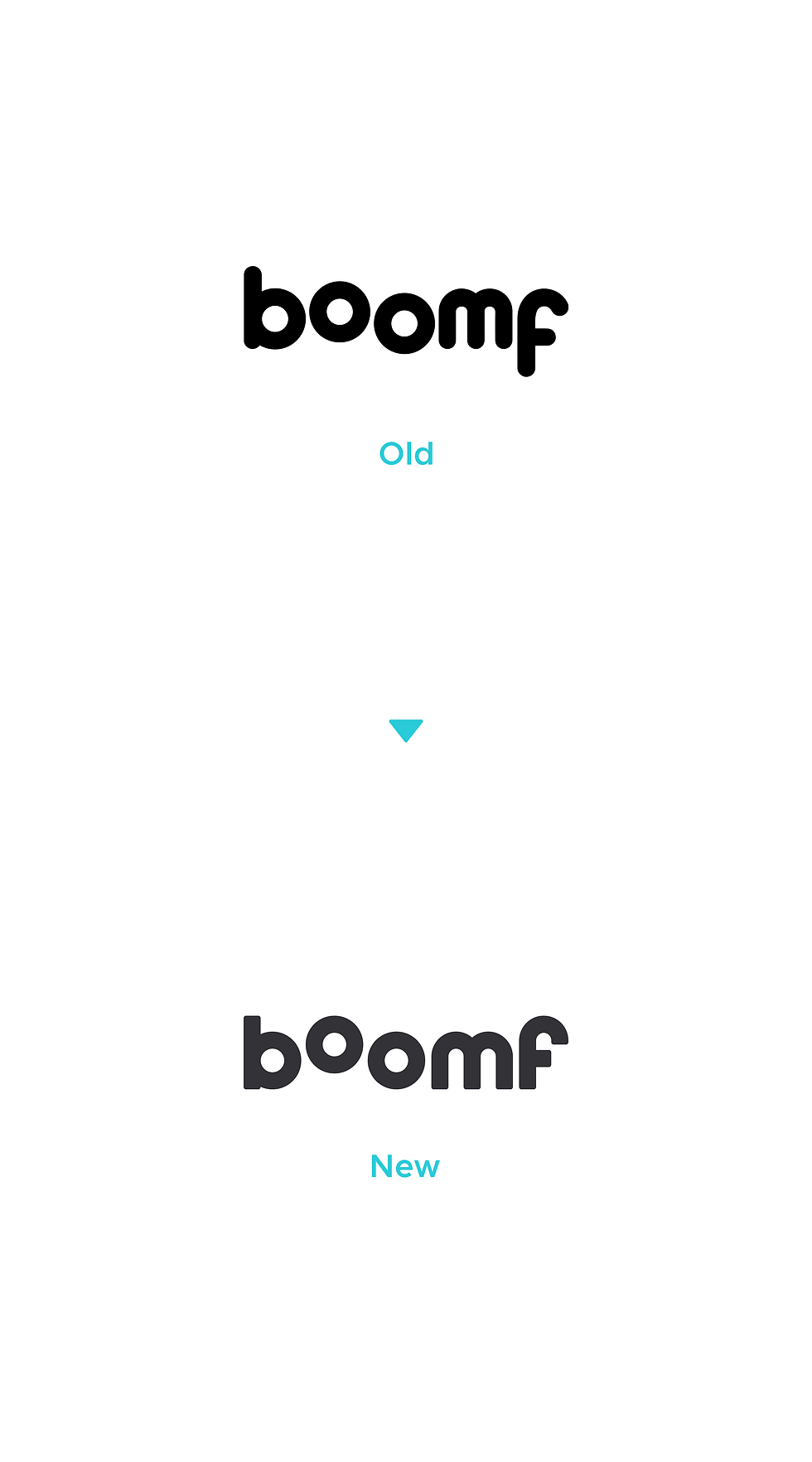
When designing the new logo I wanted to retain the some aspects of the previous one such as the offset bassline of the second 'o' which I thought captured the pop up feature of the Boomf products.
The main changes made was to the type sitting on the same bassline by shift the 'f' up with the rest of the type. Also going for a more straight edge design oppose to a rounded type design but still slightly rounding off the corners to give it a soft look and feel.
Logo design


